MAKE A MEME
View Large Image
| View Original: | Poorestquintilebysurvivingondollar.jpg (738x481) | |||
| Download: | Original | Medium | Small | Thumb |
| Courtesy of: | commons.wikimedia.org | More Like This | ||
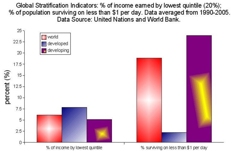
| Keywords: Poorestquintilebysurvivingondollar.jpg This is a chart depicting two indicators of poverty for the world developed countries and developing countries The indicators are 1 the percentage of income earned by the poorest 20 or quintile in a country and 2 the percentage of people in a country living on less than 1 per day The data for this chart come from the United Nations and the World Bank --RTCEarly 01 36 21 December 2006 UTC Sociological bar charts Economic inequality | ||||