MAKE A MEME
View Large Image
| View Original: | PercentOfUSPopInEachState.gif (1513x983) | |||
| Download: | Original | Medium | Small | Thumb |
| Courtesy of: | commons.wikimedia.org | More Like This | ||
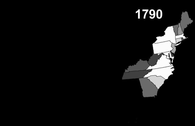
| Keywords: PercentOfUSPopInEachState.gif This map shows the historical movement of the US population among the various states and territories Brighter states have a larger share of the national population; darker states have a smaller share My own work US Census data PD Map 2007-10-11 Szu Public domain Animated maps of the United States Maps of the history of the United States Population maps | ||||