MAKE A MEME
View Large Image

| View Original: | Clickable_BUY_NOW_button_sells_SCOOTV_(1).png (1600x1200) | |||
| Download: | Original | Medium | Small | Thumb |
| Courtesy of: | www.flickr.com | More Like This | ||
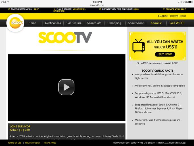
| Keywords: RE: Clickable "BUY NOW" button sells SCOOTV Dear Sir, I hope this letter finds you well. I refer to the Photos Attached – I enjoyed my flight with Scoot. However I was mislead by the “Buy Now” button located on the right hand side of the ScooTV website under “All you can watch for under … $11”. The “Buy Now” button was not clickable and resulted in wasting my time and created unnecessary confusion. I hope that the website could be redesigned ergonomically and avoid future confusion that would lead to brand damage. An unsatisfactory flight experience lead to loss of sales and profits from not only one customer but also his/her circle of influence and their circle of influence. More importantly this cause a significant reduction in your salary increments and bonuses. Could you kindly spare 3 mins to delegate this task to your assistant so she/he can delegate others to carry out the necessary review and implementation? By championing this change as a new project, this would definitely look great on your curriculum vitae and justify for significant salary increments and huge bonus payouts. retail technology transportation signs foodanddrinks | ||||